Friday, April 15, 2011

Catalog Finds: Pottery Barn

Hi, everyone... another busy week come and gone!  Last weekend, I helped my mom choose bedding for one of the guest rooms in their new house {thank you Pottery Barn, Belk Home Store, and Home Goods}!  It's always fun to shop for other people's homes. :) My world also included a basement flood this week so I'm a little behind, but I'm pressing on with few more home projects this weekend, including my Easter tablescape that I'll share next week.  In the meantime, I thought I'd bring you a Catalog Finds post and remind you to check out my guest post on Fancy Little Things if you haven't already.  I'd love your feedback!

This Catalog Finds brings back an old favorite inspiration source.  Once again, I'm enamoured with the fabulous Pottery Barn catalog!  When the new April issue hit my mailbox, I found myself reaching for my little Post-It flags. :)  Here are my favorites this time around.

Galvanized Metal 3-Tier Stand
Love the Galvanized collection for outdoor and casual entertaining!

Coral Rug

Their new Coral Rug is so subtle yet gorgeous.

Beachcomber Flatware Caddies

The Beachcomber Serve collection adds perfect texture and interest to your dining display.

Framed Vintage Chair Prints, Set of 2

I think every decor-lover and designer should have these precious Vintage Chair prints! {These are a steal at $34 for the set!}
Sea-Life Soap Dishes

Adorable Shell and Starfish Soapdishes... only $10!

Camille Mirror

Beautiful and rustic Camille Framework Mirror... a statement piece, I think.

Much of this catalog had nautical flair and I loved every page.  Had to snag my mom her own copy at Pottery Barn so I could hang onto my own. :) 

Which is your favorite?

Happy Shopping and Happy Decorating!


Thursday, April 14, 2011

Hello Lover ... What a Difference a {Shade} Makes

Remember this on my list of projects?

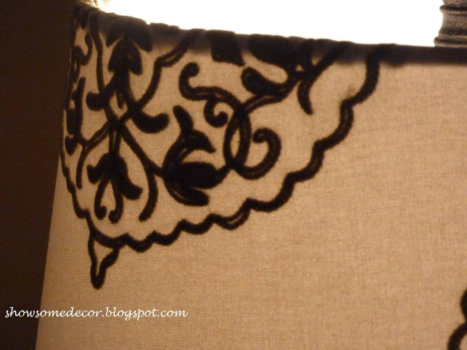
This is one of my family room lamps and though I love the base, the shade just did nothing for me-- it simply seemed to blend into the wall, in fact.  So in my quest to lighten and brighten earlier this year, this popped up on my list of projects.  I originally intended to buy a simple drum shade and cover it with a fabric with flair.

Then I happened to be in Home Goods {goody, goody!!} with my mom last weekend and I found this:


It had me at hello! 


Gorgeous detail with just the right amount of pop.  And the price tag was a winner, too, at just under $30.

Sigh.  Adore.  Happy. :)

What have you found in Home Goods lately?

Tuesday, April 12, 2011

Decor...It's Personal {and today it's Fancy}

You’ve probably heard it before, but then you open a glossy shelter magazine.  Crisp and creative home décor leaps off the page at you and the feelings of “why can’t my home look like this” creep in.  Clutter-free coffee tables and kitchen counters, gleaming appliances, fresh flowers on the mantle, and large-scale museum quality art pieces catch your wistful eye.  We all have that feeling sometimes, even when we love our homes. 

Today I'm featured over at Fancy Little Things, so head over there to read more (and show a little love in the comments if you don't mind:))!


Happy Decorating!


Monday, April 11, 2011

Color it Spring!

I love seeing fresh new colors for spring... makes me want to break out the rollers and drop cloths!  HGTV.com posted some eye-opening ideas for introducing spring color to your decor.  Here are my favorites...


WOW! Are you awake yet?  Love the pop of tomato red with the turquoise and apple green.


Hot pink, pink, and red... with lots of crisp white. Love, love!


Apple green and white offset the abundance of honeysuckle.


Blue and yellow... again with crisp white.


A softer green-- almost a celery.  Very fresh.


LOTS of vibrant yellow!!  Personally, I would have to stick with fewer accents, but I love the boldness.  Now I KNOW you're awake!!

All images from HGTV.com.

If you haven't already signed up for their e-blast, I highly recommend it.  Packed with great home improvement, decorating, and DIY information.

Which one is your favorite?  Which one is too much for you? Are you painting this spring?

Have a colorful day and Happy Decorating!

Friday, April 8, 2011

Spring Mantle Makeover

I do love to decorate seasonally and in fact, I'm notorious for moving things around my home on a regular basis...redecorating on the cheap!  I've been tweaking this mantle for several weeks now and think I've finally hit on the look that will carry me through until it's time to redo for summer (or my daughter's graduation party!).


I decided to keep it really clean and simple with pops of blue and green.  The mirror was a Ballards Backroom score back in January.


This painting was done by my great-grandmother...I don't have alot of nautical-themed pieces, but this is one I love and decided to showcase.


Sweet little Willow House Firefly Lanterns and the nest and eggs is from Target (in their Smith and Hawkin section).


Too in love with my Cordova Sconces with the Terrace Accent Plates to change them.  And I'm sure you'll recognize the Santorini Urn!  I piled a variety of textured spheres and some faux artichokes into a silver dish for interest. 


Antique books (in Swedish) from Avolli, except for the Louisa May Alcott which was my grandmother's.  Little bird came from the fabulous Outrageous Interiors here in Marietta (great place for affordable accessories).  The stone pedestal is from Willow House, too.


It's the Coronado Stone Pedestal and it's grown on me!  I love that the glass cylinder gives you so much flexibility with fillers and the base adds substance and can be used separately.  Here I've filled it with my faithful split peas and a pillar candle. 

So here it is again-- super simple...and easy to dust.  It is pollen season here in Georgia, after all :)


Linking up today with Beth at The Stories of A to Z!


Happy Decorating!

Wednesday, April 6, 2011

Bookcase Backgrounds

I've been contemplating painting the inside of my family room bookcase for the past two months. 

Of course, being the redecorranging fanatic that I am, it looks different today than it does in this pic from a month ago (I know, I know...).  But I still want all my treasures to pop and am thinking color on the inside is the way to achieve this.

realsimple.com


elledecor.com

Real Simple's tips vary from going one shade darker than your wall color to using an accent color instead.  Hmm.


Here's our family room paint color: Porter Paint's Lincoln Beige.  Because my bookcases are tucked into a somewhat dark corner of the room, I would be afraid to put anything darker than this inside them.  I could use this exact color though.

Or, I have some spare Behr Tide Pools left over from repainting the kids' bathroom.


In the kids' bath, it looks a lot bluer than the chip, so I'm thinking it might be a pretty accent color.

Or I have this lovely gray-green, Porter's Ripe Riesling, in my foyer, but I'm afraid it would be too gray.


Ugh.  OK, here's my plan:  Try the Tide Pools.  If I don't like that, try Lincoln Beige.  If neither of them work, head to the paint store for more options.  Here's where you come in, readers...

Would you go with a shade of the wall color, or would you try an accent color? 

Tune in tomorrow-- I'll be posting my Spring mantle and linking up with Beth over at The Stories of A To Z!  And next week I'll be guest posting over at Fancy Little Things. :)  See you then!

Happy Decorating!

Monday, April 4, 2011

I've Always Been a Book Worm

Some things never change!  Remember when I found these lovelies on Tricia's blog?


Well, it truly became a case of "I Can't Resist" and I ordered a few from her fabulous shop, Avolli. Tricia hand-picked my books for me...you heard right.  She gives incredible customer service and is a sweet spirited friend to boot!  So my lovelies arrived and here they are, right at home with my handful of other meaningful antique books from my grandmother.


Tricia chose Jack London titles for me... in Swedish!


I love how the edges of these pages are marbled, just like the cover!


I added my grandmother's Louisa May Alcott book to balance the blues on the mantle.  Love the combination of colors and textures.

My other antique books moved to my coffee table on the silver tray.


Not only do I love the personal touches and slices of history these provide, but they're beautiful, too. And they can work in any decor... I've pulled together an ideabook on Houzz to show you how.

How about you?  Any vintage titles on your shelves or tables?

Linking up with Cha Cha's Sentimental Sundays...
Sit Relax and Read

Happy Decorating!