Friday, September 30, 2011

September's Favorite Things

I can't believe today is the last day of September.  Seems like I was just taking off for Labor Day weekend a couple of days ago.  Daylight Savings Time, fall festivals, and Halloween are right around the corner.  Do you know that my preschool team has already had our meeting for November projects?  Yikes!

October will be a big month here at Show Some Decor.  I'll share more along the way, but suffice to say, my creative juices are flowing and you'll be treated to lots of "new".  I see some late nights in my future-- I mean late-er that is. :)

Now, on to some of my favorite things for September...


This is Edie's baluster in her new home.  Edie blogs at Life in Grace, and if you haven't checked out her space, you are missing out in every way.  Edie and her husband (and oodles of children that she home-schools) are rebuilding after a devastating fire destroyed their home last December.  This post is the story of her balusters, how she chose them, and the insight she gained upon their installation.  Nothing short of amazing and inspiring.  Last winter when I had the flu, I spent hours reading through her archived posts that journal her family, her faith, her home, the aftermath of the fire, and her heart.  Great reading and most recently some fabulous eye candy in their almost-finished home.


This little slipper chair belonged to my grandmother.  When I rearranged my Mom Cave ...um, home office, I had a space for her.  The slip cover is the same one my grandmother used (there's beautiful red velvet upholstry underneath) and will probably be updated soon, but for now she looks right at home.


My grandmother was an amazing woman who died in 2009 at the age of 102.  She wore her stockings, pumps, a brooch and lipstick every day, almost right up to the end.  I think she'd like her little chair dressed properly with my cute little Target pillow find.


And don't tell my grandmother, but these are my new fave shoes!  Pefect for transitioning out of flip flops (and killer for casual days at the preschool, I might add).  You can find yours HEREYou're welcome. :-)

And just a reminder that today is last day of our Willow House Back to School Sale!

If you have trouble viewing this image, click HERE for the PDF.  Then click HERE to visit my store and place your order!  Ships directly to you. :)
Happy Weekend and see you in October!

Linking Up!


Wednesday, September 28, 2011

Re-Thinking the Mom Cave

It all started with this...


Remember this roadblock to my Mom Cave/home office makeover?  Should they stay or should they go was playing in my head.  While the moldings are pretty in some spaces, I'm kinda over them in here and the limitations they place on wall art.

My fear is that should I try to remove them, the damage to the wall could be extensive.  They've been in place for 26 years, caulked and repainted multiple times etc. I have been firmly in the camp of keeping my beloved purple walls (read about that HERE). I had decided to go creamy white below the chair rail, leaving those moldings in place. But repaint the entire room after repairing walls? So frustrating!  Everything else was moving along (slowly).  This could bring it all to a screeching halt.  But the white moldings on the purple walls was just too much going on for me now.  What's a girl to do?

Don't you love it when inspiration/distraction arrives in the mailbox?  Enter October's House Beautiful. 

Hellooooo, Lover!

And these images...


*Sigh.*

Masterful use of the color purple in a decidedly feminine space.  But look at the wall color.

And when you see all the lucious fabrics and throws out now in aubergine and lavendar -- even Target is in on the action with Sabrina Soto's new line!  Rooms with purple walls are not easy to accessorize.  I can't believe I'm actually saying this: Rooms with cool gray walls look lovely accessorized with purple.

So...

Amazing how many different shades of gray there are!!

Yes, I'll have to a little repair work anyway.  Wonder how I'll feel about those pesky white moldings with soft gray walls?  Or maybe I'll just do as Elizabeth at The Mustard Ceilings suggested and paint them the same color so they just blend in (you planted a wonderful seed there, Elizabeth!)?  Maybe the same shade of gray but in a semi-gloss?

And here's how my art for the Mom Cave is coming along--  I'm tempted to hang them and see if I can work around those DMs (darn moldings) after all.


Aren't they awesome?

Ok, so weigh in and let me know your thoughts!  Go gray and have fun with pops of my beloved purple?  Preserve the purple paint? Keep the moldings?  Kick 'em to the curb and deal with the wall repair?  Can't wait to hear what you think. :)
Happy Decorating!

Monday, September 26, 2011

Mirror Transformation

Happy Monday, gang! I hope you had a productive but relaxing weekend. :) I don't know about you, but my fall nesting is kicking in.  I feel the autumn chi beginning to flow, but I still have a way to go!  A couple of weeks ago, I came across this mirror in a basement closet.


It's one of those bought-inexpensively-for-a-purpose-that-never-manifested-itself things.  Don't we all have one of those lurking in our basement closet?  This one's been lurking for about six years now, but my DIY lightbulb went off when I found it this time.

I've been longing for a mirror in my dining room for some time now but haven't found the perfect one at the perfect price.  Well, this baby had the perfect price (FREE!) and could become a little closer to the perfect one with a little help from Martha.


I was afraid spray paint would give me a too-even finish, and I wanted something a little less perfect.  Enter Martha's Metallic Glaze in Mercury, sort of a silvery shade of pearl.  I had never used this product before, but I figured what the heck?


I taped off the edge of the mirror first (I'm sometimes a sloppy painter) and brushed a thin coat of the glaze on the frame.  Now, this was a little tricky; the brush marks were very noticeable, and though I wanted them to be somewhat noticeable, I didn't want it to look too hodge-podgey.  The look I was happiest with was when I went all around the frame in one continuous swoop and then feathered the stroke off the edge.


It took two coats to get the look I really wanted, and this stuff has a looooong drying time.  I'm not sure if that's the nature of the product or if I was putting it on a little thicker than you would for other glazing projects.  At any rate, if you're doing a second coat, make sure the first is completely dry before you dive in!


So here she is in her new home! I love that it has a pewter-like finish to it now.  It's perfectly imperfect. I'd show you more of the big picture, but you see that mess on my dining room table?  Yes, that's an upcoming fall tablescape in the works!  Oh, and the dark green paint on the walls?  Yeah, that's going soon, too. :) See how I've pulled the blinds all the way up on the window? Because I have a covered front porch, this room doesn't get a whole lotta light.  When I painted the room 12 years ago (!) it functioned as a front "living room" and had a cozy vibe.  Now that it's my dining room (has been for 6 years now!) I want lighter and brighter.  The blinds are going, gang.  I see some great floor to ceiling drapes in my future, but that's another post all together! Did I say my autumn chi was beginning to flow?

The mirror was a freebie and the glaze was around $6 at Home Depot.  Not bad, eh?

Linking Up!


Happy Decorating!

Friday, September 23, 2011

{A} is for Apple :)

Happy Friday and Happy Fall, y'all! For some reason this week seemed odd and off a bit to me... barometric pressure? the moon?  onset of the autumnal equinox?  Not sure, but we made it to the end-- woo hoo!

If you've been a reader for a while, you know that my "day" job is a preschool teacher, which means I get to finger paint, sing, act silly, memorize Bible verses, teach phonics, and come up with all kinds of fun projects to keep my 4 year old sweeties engaged and learning.  This week we were reviewing the vowels and digging into our unit on apples, so we made Apple Pizzas.

They turned out sooooo yummy and were such a piece of cake to make hit, I thought I'd share.  You can make this more complicated from scratch if you like.  I kept it simple so the kiddos could participate. The whole school smelled good, too, while they were baking. :)


What You Need:
  • can of refrigerated biscuits
  • aluminum foil covered cookie sheet or jelly roll pan, lightly greased
  • applesauce or grated fresh apples (can you guess which one I used?)
  • cinnamon sugar for sprinkling
What You Do:
  • Preheat oven according to biscuit package directions.
  • Lay biscuits out onto foil-covered cookie sheet.  We wrote their names in Sharpie beside each biscuit.
  • Press the individual biscuits, flattening out to about 1/2 to 2/3 inch thick (the children can do this).
  • Spread a layer of applesauce on top of the biscuit (the children did this with the backs of spoons).
  • Sprinkle cinnamon sugar generously on top. :)
  • Bake biscuits according to directions, plus a minute or two.  The edges should be golden.  The center will seem a little doughy to the touch because of the applesauce, but it will be done.
  • Let cool a bit and enjoy!
These make a yummy breakfast treat or snack.  You're welcome! 

Today I'm perusing one of my favorite home stores for more fall inspiration.  I'll share with you next week, just in case you haven't found your autumn chi yet.

Linking up!

Join  us Saturdays at tatertotsandjello.com for the weekend wrap 
 up           party!


Have a great weekend. :)

Wednesday, September 21, 2011

I Can't Resist... this Driftwood Bull

Driftwood Bull

from Ballard Designs.

I don't know why, but he just speaks to me. :)  Probably the combination of softly weathered natural elements, all the wonderful shades of gray, and the texture. Or maybe seeing an animal rendered in this material?  A cool marriage of my West Texas roots and my love for the beach. :) Forget the driftwood mirrors, give me the Bull!!

Happy Decorating!


Monday, September 19, 2011

Taking a Shine to Pumpkins

I really wanted these.

Antique Mercury Glass Pumpkin

Sigh.  They were sold out online {which is probably a good thing}.  My decorating budget is slim pickings this year with one in college, but I simply cannot get on board with the warm and toasty pumpkin orange this year.

So I decided to take a few ugly plastic-ish pumpkins and help them get their shine on-- with a little help from Krylon.


The three little guys were in my fall decor stash from God-knows-when, but I picked up the larger one at Walmart for $4.99 because of it's scale and something special I have in mind for it.


I have shiny finish metallic silver and gold spray paint, but I wanted something a little more subtle.  This caramel latte color just spoke to me. :)


I taped off the stem of the large one because I actually like the texture and color as a low contrast to the new metallic finish.  The little guys didn't have much stem to speak of, so I just went for it.


Love this silvery look!  The top of the stem of the small pumpkins retained just a bit of orange from me picking them up to spray the bottoms.  I love how the nubby texture of the littlest really shows up now.


And here's where two of them ended up!
 If you missed my entire fall mantle you can see it HERE.

Wait'll you see what happened to the large pumpkin -- a cool and classy fall touch {coming soon}.

How about you?  Feel like swapping pumpkin orange for another color this fall?

Linking up here:


Happy Decorating!

Friday, September 16, 2011

Finding my Autumn "Chi" {Fall Mantle}

Finally! A day where I can actually feel fall in the air!  I've been in search of my autumn "chi" since the blogosphere and magazines began exploding with fall decor, recipes, color schemes, etc, and I just couldn't get there.  Maybe crossing over into the second half of September, maybe the chill that blew in last night on a cold front, or maybe that delectable Skinny Cinnamon Dolce latte at Starbucks did it.  Whatever it was, I woke up feeling like beginning the zhushing for fall.  My autumn chi is emerging. :)

I decided to start with the mantle and here's what I came up with...


I've decided I can't quite get on board with the oranges and heavier colors for fall this year.  I'm staying more neutral to keep my spaces as bright as possible.


Nothing says "autumn" like sheafs of wheat, right?  These have been hiding out in stash of decorative items for a couple of years now.  They bring the urn from summer beachy to rustic fall perfectly.


I added texture to my grandmother's silver dish with pine cones and straw spheres.  The combination of tans and browns with the silver keeps it interesting.


This fabulous antique Swedish etching came from my friend Tricia's antique shop she closed this summer.  My little bird marries the umber tones in the art with the blue urn.


Super simple changes here!  I just turned my antique books around so the pages faced out (I love the marbled detailing on one of them!) and added a couple of metallic pumpkins as a nod to the season. {Tutorial  on them coming next week}.

And so one more look at my fall mantle... for now, that is! ;-)


Have you found your autumn chi yet??

Linking up in these wonderful places:

Join  us Saturdays at tatertotsandjello.com for the weekend wrap 
 up           party!


The Lettered Cottage

Tuesday, September 13, 2011

Have You Seen This? {Restoration Hardware}

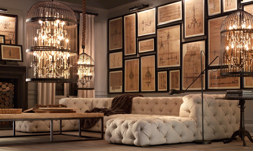
Vintage Birdcage Chandelier X-Small'
The Vintage Birdcage Chandelier from Restoration Hardware.

I think this piece is actually more appealing when you see it in a room...


I love the look of the cage and chandelier itself, but the thick marine rope seems odd to me and the $2K price tag (yes, you read that right) is way out of reach for the vast majority of us.  That crazy tufted sofa -- I can't even go there. :)

I'm thinking this look (minus the marine rope) could be recreated for less. What do you think of this lighting?   Thumbs up or thumbs down?

Happy Decorating!

Monday, September 12, 2011

Fall Decor {Rustic or Refined?}

Now that Labor Day is behind us, I've started thinking about decorating for fall-- plus the onslaught of awesome catalogs in my mailbox has got me longing for cooler temps!  I started digging through my magazines, catalogs, and the internet to find some fresh inspiration.  But I'm conflicted on whether I want to go more rustic, more refined, or something in between.  Here's a few images that have got me thinking...
Antique Mercury Glass Pumpkin
potterybarn.com


House Beautiful


Acorn Ornament Tree Centerpiece

bhg.com

Silver pumpkins on crystal vases

bhg.com

Orchard Fruits

bhg.com

Autumn Curb Appeal

bhg.com


marthastewart.com

Cornucopia Door Arrangement
marthastewart.com

Autumn Planters

marthastewart.com

So what about you?  Will your fall decorating be rustic or refined?
Happy Decorating!